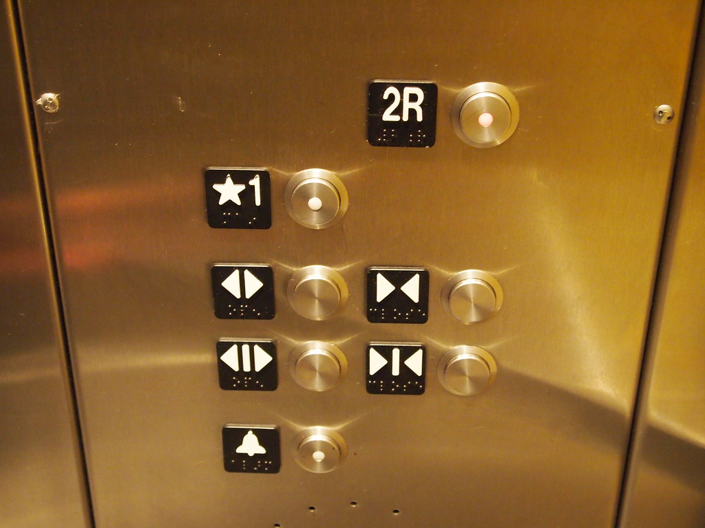
The Placebo Button
Over the summer, a former student “interviewed” me over e-mail about placebo buttons. If you’re unaware, placebo buttons are buttons that don’t actually do anything and are instead used to make a person feel in control of the situation. The most commonly referenced buttons are elevator close buttons (they just close on their own) and pedestrian press-to-cross buttons at intersections. Patrick did a small, informal study that he wrote about at EXBERLINER entitled Idiot buttons: The brutal truth about Berlin’s pedestrian crossings. He found this:
After studying 30 pedestrian crossings, we found that 28 of the buttons had no effect at all on the length of time you might wait for a green Ampelmännchen to finally show up. (The two exceptions were at tram crossings, where it’s likely that the variation in timing could actually be down to the presence or lack of trams, rather than the pressing of a button.)
This is such an interesting facet of User Experience design because it is an interface that has no action behind it. It’s an empty interaction. Users, in this case pedestrians, feel like they have control because the interface is the same as other interfaces in which they do have control – elevator floors, ovens, washing machines – and have developed a mental model around these other objects.
I thought it would be fun to post the whole background interview in case this kind of design interests you.
Other than crosswalks, what are some good examples of placebo buttons that people might like to know about?One of the legendary placebo buttons is the close door button in elevators. Some elevators may use it now, but, many just have it hooked up as a dummy.
What problem are placebo buttons created to solve? In your opinion, do they solve this problem well?
Placebo buttons help people feel in control of technology. It gives them a sense of agency when in reality, the systems do what they were programmed to do. It also leads to feeling empowered as if we control this technology when, in reality, the technology can control us.
I do think buttons like this give us a feeling of control even if we don’t actually have it.
You’ve been teaching classes on user-centered design for quite a while. When students have found out about placebo buttons for the first time, what kinds of reactions have you seen?I learned about cross-walks and elevators when I was learning about interactive technologies in the late 1990’s in my Master’s program and started teaching about them shortly after. Some students are angry and don’t believe that’s true or they think it used to be true but not anymore. Some think it makes sense in comparison to their lived experiences. Some are happy to realize it wasn’t just them who thought it was a sham.
https://www.sciencealert.com/the-close-door-buttons-in-elevators-don-t-actually-do-anything
Do you think these types of buttons or inputs are going to become more common or less common in coming years? Why?I think technology continues to evolve in a black box format, meaning, no one really knows how it works and any knob, dial, or button that lets them feel like they are in control will be important. This will be even more true as technology begins to leverage things like Machine Learning to make “smart” decisions. People will want to be able to control something that was designed to control itself.
Something I thought of after the email exchange: I also think that these kinds of buttons give developers new items with which to use in diagnostics.
What is the earliest use of this type of device that you know of?That’s a great question that I do not know!
Is there any one designer or author who has popularized the placebo button within the design community?**Probably Don Norman.
Other readings: https://99percentinvisible.org/article/user-illusion-everyday-placebo-buttons-create-semblance-control/